When I love a color or pattern, I have to use it. I have to find a way to incorporate it into my life as art, jewelry or something. In this case, the item I fell for was adhesive paper pineapples. They were whimsical, gently colorful and completely wonderful.
I bought them at a craft store and I knew that I would love seeing them on a small match box. I chose scrapbook paper to complement the pineapples and set to work.
First I slide the drawer of matches out of the box. I use the box as a template and trace the paper to the size I need. Remember to leave one side of the "strike a match" box uncovered so that you can still light matches. I cut the paper to size and use Elmer's white glue and a sponge brush to apply a thin layer of glue to one side of the box. I gently put the paper in place on the glue, smooth it out and let it dry. Once it's dry you can bend the paper at the corners and get a better/closer fit and you glue the remaining 2 sides. Once the entire box is dry, you may want to take fine scissors and trim off any excess paper. Now glue/stick on the adornment of your choice. Slide the drawer of matches back into the box and you're ready to put it on display.
We spend time buying just the right candles for our home, I think the match box nearby should be just as perfect. If you start looking in the sticker/embellishment department in the craft store, I bet your mind will start racing. Should you go with a theme? color? The choice is yours, just promise to show me when you're finished.
#crafting #crafts #makersgonnamake #matchbox #pineapple #hospitality
The beauty of everyday life - photographs, thoughts and ideas from Anne Reeves.
Showing posts with label Interior design. Show all posts
Monday, July 30, 2018
Friday, March 9, 2018
Primulas: Brighten Your Table Instantly
I just wanted to take a minute to encourage you to buy primulas. They are an easy way to bring a happy touch into your home. On the West Coast, primulas have been available for a while now and they should start appearing at home improvement centers in the Midwest any time now. These happy-go-lucky plants are reasonable (often $1.25/plant) and they look so pretty in the center of the table.
I know that on the West Coast, these annuals are often planted in casual landscaping or in pots outdoors and have a long bloom time. I must confess that I do not buy them with the plan to keep them around. My wish is to enjoy them for 2-3 weeks of color and cheerful decoration.
I brought out 4 neutral place mats, some bamboo-style silverware and 4 print napkins that my aunt gave me for Christmas. What makes the table look finished? 6 fresh primulas (still in their original plastic pots) resting on clear plastic saucers to protect the table. Voila!
I know that on the West Coast, these annuals are often planted in casual landscaping or in pots outdoors and have a long bloom time. I must confess that I do not buy them with the plan to keep them around. My wish is to enjoy them for 2-3 weeks of color and cheerful decoration.
I brought out 4 neutral place mats, some bamboo-style silverware and 4 print napkins that my aunt gave me for Christmas. What makes the table look finished? 6 fresh primulas (still in their original plastic pots) resting on clear plastic saucers to protect the table. Voila!
Friday, January 26, 2018
Dollhouse Seed Packets: Whimsical Art
Do you have Spring Fever too? I know that gardeners around the country are pouring over garden catalogs and dreaming of a bountiful season.
Years ago I bought this sheet of dollhouse seed packets. I didn't want it for cute effect in tiny house but as an interesting touch in a real house. The sheet is about 4 x 3 inches and I framed it in a 4 x 6 matte black frame and put it on display on a beverage cart in my living room.
It was a beautiful touch and one that was interesting too. A teeny-tiny conversation piece on its own that gave a nod to one of my hobbies. What do you think? What unexpected piece of paper could you frame?
Years ago I bought this sheet of dollhouse seed packets. I didn't want it for cute effect in tiny house but as an interesting touch in a real house. The sheet is about 4 x 3 inches and I framed it in a 4 x 6 matte black frame and put it on display on a beverage cart in my living room.
It was a beautiful touch and one that was interesting too. A teeny-tiny conversation piece on its own that gave a nod to one of my hobbies. What do you think? What unexpected piece of paper could you frame?
#art #artisrelative #dollhouse #seedpackets #gardener #interiordesign #cutetouches
Monday, October 30, 2017
Making A Home: Flowers Help Add Warmth
I am making a home in the Pacific Northwest. While I used to call our style "Swedish Beach House" (oval back dining chairs, plate racks with dishes, blue & white furniture), our new style is evolving into what I'm calling '"New Nordic" (birch and wood, neutrals, lots of light). I know it might seem silly, but naming my design aesthetic amuses me.
So far, the furniture from our old house looks great in our new place. Some friends have visited and not even recognized it. The walls are neutral, the floors are dark wood or light carpeting. Slowly but surely, I am getting a handle on where I want the lamps and which decorative touches work.
My favorite question so far has been "Are those flowers real?"
Yes, flowers are my oxygen and I try to have some in the house each week. When the farmers markets are rocking from May 1 - Oct 1, its easy. After that, the grocery store will do. This image (a gentle dahlia bouquet) was taken in the end of September. A month has pasted, but somehow my roses still have blooms for me to snip! I'm loving this new climate.
I will show you vignettes around the house as I decorate this holiday season. I have so many bits and bobs I can't wait to see what fits where.
So far, the furniture from our old house looks great in our new place. Some friends have visited and not even recognized it. The walls are neutral, the floors are dark wood or light carpeting. Slowly but surely, I am getting a handle on where I want the lamps and which decorative touches work.
My favorite question so far has been "Are those flowers real?"
Yes, flowers are my oxygen and I try to have some in the house each week. When the farmers markets are rocking from May 1 - Oct 1, its easy. After that, the grocery store will do. This image (a gentle dahlia bouquet) was taken in the end of September. A month has pasted, but somehow my roses still have blooms for me to snip! I'm loving this new climate.
I will show you vignettes around the house as I decorate this holiday season. I have so many bits and bobs I can't wait to see what fits where.
Monday, September 18, 2017
Daring Rugs: Style Right Out of the Magazines
I can only pat myself on the back when something I choose for the house ends up in the magazines. I saw this Moroccan Diamond rug online and knew that it would add a colorful/Pacific Northwest/Native American touch to our cream foyer with dark wood floors.
In my mind, it's perfect and I would recommend it to anyone drawn to it. I felt in sync with the HGTV magazine editors for they have featured a similar diamond print rug in two price points in their Hi/Low List in the October issue.
When the rug arrived, I sprayed it with Scotch Guard fabric and upholstery protector so that I can have a leg up on stain fighting. Dan says it's mean to make people enter the house on an off white rug, but I'm not afraid. I love how this looks and I'll deal with the consequences later. And yes, this is the Pacific NorthWET, I will put down a cotton throw rug to absorb damp feet when the rainy season begins.
In my mind, it's perfect and I would recommend it to anyone drawn to it. I felt in sync with the HGTV magazine editors for they have featured a similar diamond print rug in two price points in their Hi/Low List in the October issue.
When the rug arrived, I sprayed it with Scotch Guard fabric and upholstery protector so that I can have a leg up on stain fighting. Dan says it's mean to make people enter the house on an off white rug, but I'm not afraid. I love how this looks and I'll deal with the consequences later. And yes, this is the Pacific NorthWET, I will put down a cotton throw rug to absorb damp feet when the rainy season begins.
Tuesday, September 12, 2017
QuatroStyle Kitchen Tiles: Easy Reasonable Striking Removable
You should know...my new tile backsplash is made of stickers. I'll let that sink in for a minute.
Stickers. Adhesive stickers. Removable stickers. Low commitment stickers. I know! I am just thrilled.
I have been pouring over design magazines for months. I watch Chip & Joanna on Fixer Upper. I look at the binder of images I've collected over the years. I have Pinterest boards for my Pinterest boards. It has been great. So I can't tell you exactly what source led me to QuatroStyle on Etsy, but I can tell you that I ordered within days of finding them.
I spent $84 for these 30 sticker tiles. While that may seem like a lot for stickers, it is nothing compared to the price (and permanency) of installing real tile. Nothing.
Look at the same area of the kitchen, just minutes before installation and compared to the first photo, I know you'll agree that the tiles add a lot of visual oomph.
The installation was simple. The only think you have to be conscious of is finding the center of the area you are covering. I chose to start there so that the rows would be centered and even. I took my time peeling and sticking the tiles, but it still couldn't have taken more than 40 min. I have since tacked up 2 pieces of white trim molding to blur the depth between the wall and the stickers. Tiles would have depth, so the molding gives the illusion of depth. When I get a chance, I'll take a picture that includes the molding to show you.Easy. Reasonable. Striking. Removable.
Thank you, QuatroStyle!
#interiordesign #designonabudget #ididit #kitchen
Monday, May 1, 2017
Green Accents: When Color Makes the Meal
Nothing says spring like verdant green accents. The trees are bursting with bright green growth and my table is reflecting that happy time.
I've combined some inexpensive green glasses from CB2 (sadly they have discontinued this color), my Tea Time trivet project and some bright green Heather Bailey napkins to bring the table alive.
When I bought my latest multi-hued hydrangea (pale green with pink splashes), a bloom broke off and my pull toward green and pink began.
The most important message of this post is this:
I set the table even though nothing is happening and no one is coming over. I like to look at beautiful linens, flowers and colors and I shouldn't have to wait for an occasion to use what I have. When I set the table, the house comes alive.
If your kitchen table is collecting bits and bobs, go clear it off and make yourself a pretty table setting.
I've combined some inexpensive green glasses from CB2 (sadly they have discontinued this color), my Tea Time trivet project and some bright green Heather Bailey napkins to bring the table alive.
When I bought my latest multi-hued hydrangea (pale green with pink splashes), a bloom broke off and my pull toward green and pink began.
The most important message of this post is this:
I set the table even though nothing is happening and no one is coming over. I like to look at beautiful linens, flowers and colors and I shouldn't have to wait for an occasion to use what I have. When I set the table, the house comes alive.
If your kitchen table is collecting bits and bobs, go clear it off and make yourself a pretty table setting.
Tuesday, February 28, 2017
My Own Color Chart: Tea with Milk
The main table and chairs in our new house are actually a set my parents had from years ago. I have been calling the color of the wood butterscotch for months now, trying to shop for fabric to recover the chair cushions and to bring the overall decorating scheme together.
Yesterday, I walked past the table carrying a mug of tea and it became very clear that the color of this wood is Tea with Milk. Cute, eh?
Labels:
Color,
decorating,
Interior design,
pantone,
Tea,
wood,
wood tone
Monday, October 24, 2016
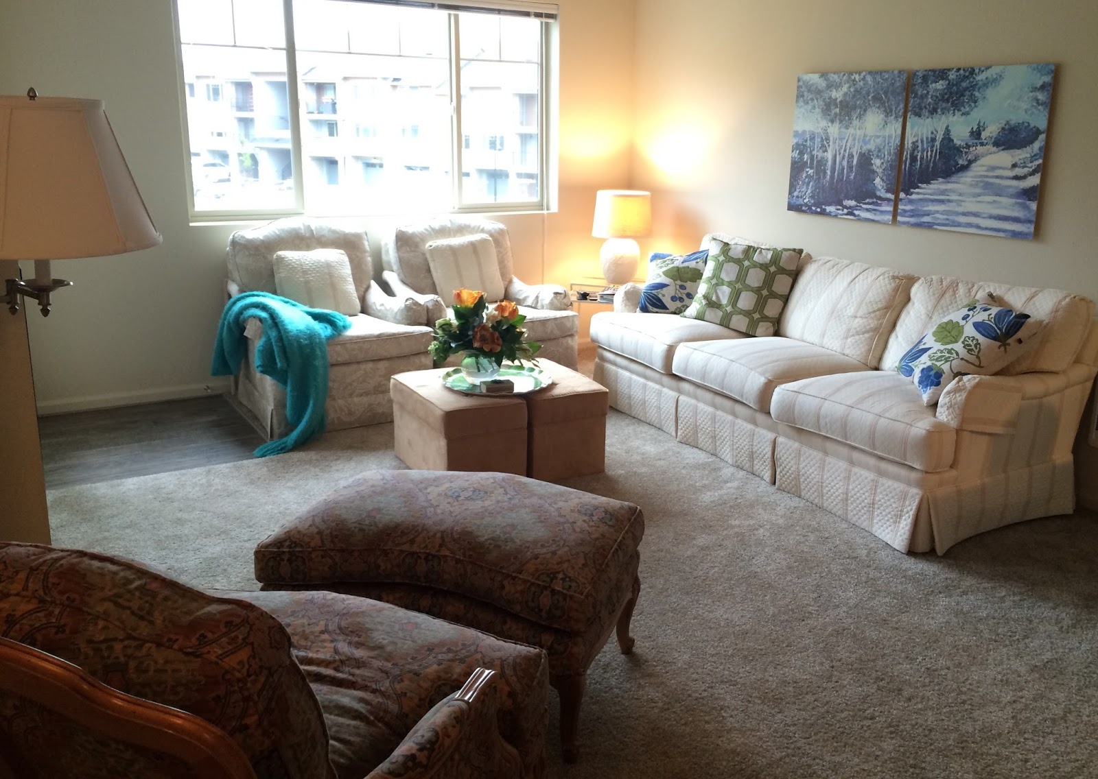
Apartment Nesting: Grateful for Furniture
When Dan took a job in Seattle, we were challenged with setting up another place to call home. We were so very lucky that my parents had extra furniture they could spare. When we told them we were setting up an apartment, they suggested we put this couch, these 2 chairs and the print chair/ottoman set on the truck.
Our plan was to keep our house in Michigan for a year or so and I would travel back and forth. Their furniture allowed us to skip the futon and make a nice little home for ourselves as we transitioned. It has been a year and 9 months since Dan moved in and a lot has changed. We've sold our house in Michigan and are building in a neighborhood on the East-side of Seattle. The funny thing is that my mom now has her own place out here in Seattle and plans on spending the winters here with us. When she comes to our apartment for dinner, sits on her couch and says "I like what we've done with the place." I usually counter with something along the lines of, "Feeling nostaglic?" It is familiar for both of us and that's wonderful.
We made the place our own by hanging a favorite pair of prints called Silver Birches by Nell Revel Smith over the couch. She paints the area in northern Michigan where we've always spent the summer and her work always makes us feel relaxed.
My mom and I scoured Homegoods and TJ Maxx for pillows with blues and greens to pull color from the art. I added a teal angora throw on one chair and placed a large circle melamine platter of a succulent (it looks a bit like this) on the butterscotch suede footrests. Doesn't it look pretty? We have since hung floor to ceiling off white drapes to soften the windows, but the room looks essentially like this.
Our plan was to keep our house in Michigan for a year or so and I would travel back and forth. Their furniture allowed us to skip the futon and make a nice little home for ourselves as we transitioned. It has been a year and 9 months since Dan moved in and a lot has changed. We've sold our house in Michigan and are building in a neighborhood on the East-side of Seattle. The funny thing is that my mom now has her own place out here in Seattle and plans on spending the winters here with us. When she comes to our apartment for dinner, sits on her couch and says "I like what we've done with the place." I usually counter with something along the lines of, "Feeling nostaglic?" It is familiar for both of us and that's wonderful.
We made the place our own by hanging a favorite pair of prints called Silver Birches by Nell Revel Smith over the couch. She paints the area in northern Michigan where we've always spent the summer and her work always makes us feel relaxed.
My mom and I scoured Homegoods and TJ Maxx for pillows with blues and greens to pull color from the art. I added a teal angora throw on one chair and placed a large circle melamine platter of a succulent (it looks a bit like this) on the butterscotch suede footrests. Doesn't it look pretty? We have since hung floor to ceiling off white drapes to soften the windows, but the room looks essentially like this.
Monday, July 20, 2015
Game On: A Vintage Game Board works as Art
Do you see the beauty too? This antique Chinese checkers board will someday hang as art in my house. I stopped into an antique shop in a strip mall and b-a-m! I saw this beautiful board. I pretended to be interested in other things, but in the end I knew that I couldn't leave without it.
The colors were so vibrant and interesting and for some reason reminded me of a bouquet of snapdragons. My first thought was to have a piece of glass cut for it and use it as a tray on an ottoman. That option is still there, but for now I have settled on hanging it on the wall as art.
I couldn't wait to show you, so I placed it in a stand so that I could photograph my new vintage treasure from 1938. It is the perfect representation of my design mantra: I like things that are beautiful and interesting.
The colors were so vibrant and interesting and for some reason reminded me of a bouquet of snapdragons. My first thought was to have a piece of glass cut for it and use it as a tray on an ottoman. That option is still there, but for now I have settled on hanging it on the wall as art.
I couldn't wait to show you, so I placed it in a stand so that I could photograph my new vintage treasure from 1938. It is the perfect representation of my design mantra: I like things that are beautiful and interesting.
Friday, April 24, 2015
Nate Berkus: That Cutie Pie Knows Design
This was the first room I tackled in our new apartment in Seattle. The key design materials are grey, black and white - a cookie cutter bathroom if there ever was one. My goal was to create a bathroom that looked beautiful, but not feminine.
My life saver was Nate Berkus and his current collection at Target. Have you seen his striking collection of linens and housewares? Bulls eye, indeed.
What a difference a shower curtain makes! I immediately knew that this was the direction that I wanted to go in. The "quaint blue" diamond pattern (truly lavender, to my eye) was graphic, but not dizzying. Confident, but not demanding. Can fabric be described in such a way? You bet your boots. I also bought the companion bath rug and it was a perfect fit in this cozy bathroom.
When I was shopping in Palm Beach Gardens, Florida, look what I found! A beautiful white ceramic dish with a pale lavender blue hydrangea blossom lid. Each petal is made of ceramic. I swooned at Homegoods and then put it in my cart. This lovely dish will start by housing Q-tips on the bathroom counter top, but if I get too nervous about it chipping, I'll move it to my bedroom dresser. Either way, I know that I will continue to love it every time I see it.
Want to hear the kicker? This very dish is featured in Victoria magazine this month! The May/June 2015 issue, page 16. It is referred to as the "Gracie" box from The Import Collection, but I wasn't able to find you a link online. I love when designs I love get featured in magazines, even if its just to show Dan that other girls "had to have it" too.
As for the overall bathroom design, thank you, Nate Berkus. I can't really paint this apartment. Wallpaper is out of reach, but you've given my bathroom style for miles. Yes, I still think of you as Cutie Pie. I loved all of the work you did on the Oprah show and I am so very happy to bring your aesthetic into my new home. I owe you one.
My life saver was Nate Berkus and his current collection at Target. Have you seen his striking collection of linens and housewares? Bulls eye, indeed.
What a difference a shower curtain makes! I immediately knew that this was the direction that I wanted to go in. The "quaint blue" diamond pattern (truly lavender, to my eye) was graphic, but not dizzying. Confident, but not demanding. Can fabric be described in such a way? You bet your boots. I also bought the companion bath rug and it was a perfect fit in this cozy bathroom.
When I was shopping in Palm Beach Gardens, Florida, look what I found! A beautiful white ceramic dish with a pale lavender blue hydrangea blossom lid. Each petal is made of ceramic. I swooned at Homegoods and then put it in my cart. This lovely dish will start by housing Q-tips on the bathroom counter top, but if I get too nervous about it chipping, I'll move it to my bedroom dresser. Either way, I know that I will continue to love it every time I see it.
You can see how beautiful it looks next to one of my Nate Berkus for Target "quaint blue" towels.
As for the overall bathroom design, thank you, Nate Berkus. I can't really paint this apartment. Wallpaper is out of reach, but you've given my bathroom style for miles. Yes, I still think of you as Cutie Pie. I loved all of the work you did on the Oprah show and I am so very happy to bring your aesthetic into my new home. I owe you one.
Friday, September 26, 2014
Heather Bailey Dishtowels
I was so very fortunate to run across some Heather Bailey dishtowels at Homegoods. I had no idea that she had expanded from fabric design into housewares, but I am so glad that she did! The colors of these dishtowels were so beautiful and bright (same pattern in a different colorway) that they fairly leapt off the shelves and into my cart. Can you see that each one has a ruffle trim? I intend to use them as large napkins in my aqua and white kitchen. Can't wait!
Heather is a fabric and embroidery designer, as well as a blogger with an enormous following at HelloMyNameIsHeather. I met her back in 2008 at the Country Living magazine Women Entrepreneur conference in Chicago. She is a delight. Warm, interesting and wholly supportive of women expressing their creativity. I found her blog tips and tricks to be very helpful and thought that she was a great addition to the panel.
I was returning as a Country Living Pitch Your Product winner for my subscription gift service and Heather was on the Women Entrepreneur panel discussing her tips and philosophy for writing a successful blog. You can see Heather on the Country Living stage (below), she is second from the left.
This must be Heather Bailey week. I came across some of her embroidery patterns at another shop here in Seattle. I bought them on the spot - I can't wait to show you.
Heather is a fabric and embroidery designer, as well as a blogger with an enormous following at HelloMyNameIsHeather. I met her back in 2008 at the Country Living magazine Women Entrepreneur conference in Chicago. She is a delight. Warm, interesting and wholly supportive of women expressing their creativity. I found her blog tips and tricks to be very helpful and thought that she was a great addition to the panel.
I was returning as a Country Living Pitch Your Product winner for my subscription gift service and Heather was on the Women Entrepreneur panel discussing her tips and philosophy for writing a successful blog. You can see Heather on the Country Living stage (below), she is second from the left.
This must be Heather Bailey week. I came across some of her embroidery patterns at another shop here in Seattle. I bought them on the spot - I can't wait to show you.
Thursday, September 4, 2014
Piano Forte: Personal Touches Based on Color
I love this vignette on the piano in our living room. Specific and unexpected touches that make it look like our house.
First, you must have music on the piano. Just because you have little ones learning Three Blind Mice in a piano book designed in the 60's, doesn't mean that you have to leave it on display. When our church changed hymnals, they offered the old ones to the congregation. I love having a meaningful piece of music highlighted with a silver page holder. I can't play the piano, but my husband might see this as encouragement to learn O Holy Night.
I pulled together small items from around the house that were black. I wanted to ground the accessories a bit and echo the black table I have between our two off white loveseats in the same room.
What 3 items did I choose for the top of the piano? A black sushi bowl used as a vase for peonies. A black and gold tin tea box that I bought as a memento in Paris at Mariage Freres. And a sheet of dollhouse seed packets, framed in black, looks very much like art to a gardener and dollhouse enthusiast like me. The art on the wall above the piano is a piece of vintage sheet music that I photographed and enlarged.
This collection is more interesting than a set of silver picture frames that I might have out at a different time of year, and are all conversation piece on their own, should anyone ask about the items. I think the most important part about collecting and arranging items is that the items are believeable. I didn't set out to buy items to go together, I walked around the house pulling from my own stash. Over time, buy items that speak to you. When you arrange them later, the history of each time (where you found it; who gave it to you; what it reminds you of) will make your storytelling all the more interesting.
Do you like my design? Perhaps you'd like to customize the top of your piano this week. Piano forte, indeed.
First, you must have music on the piano. Just because you have little ones learning Three Blind Mice in a piano book designed in the 60's, doesn't mean that you have to leave it on display. When our church changed hymnals, they offered the old ones to the congregation. I love having a meaningful piece of music highlighted with a silver page holder. I can't play the piano, but my husband might see this as encouragement to learn O Holy Night.
I pulled together small items from around the house that were black. I wanted to ground the accessories a bit and echo the black table I have between our two off white loveseats in the same room.
What 3 items did I choose for the top of the piano? A black sushi bowl used as a vase for peonies. A black and gold tin tea box that I bought as a memento in Paris at Mariage Freres. And a sheet of dollhouse seed packets, framed in black, looks very much like art to a gardener and dollhouse enthusiast like me. The art on the wall above the piano is a piece of vintage sheet music that I photographed and enlarged.
This collection is more interesting than a set of silver picture frames that I might have out at a different time of year, and are all conversation piece on their own, should anyone ask about the items. I think the most important part about collecting and arranging items is that the items are believeable. I didn't set out to buy items to go together, I walked around the house pulling from my own stash. Over time, buy items that speak to you. When you arrange them later, the history of each time (where you found it; who gave it to you; what it reminds you of) will make your storytelling all the more interesting.
Do you like my design? Perhaps you'd like to customize the top of your piano this week. Piano forte, indeed.
Friday, June 6, 2014
The Art of Living: Make Design Decisions To Boost Visual Vitamins
My decorative touches are temporary. I move items, vases and books around my house continually to make "the art of living" in my home an interesting experience for me.
I want to trumpet the idea of specifically designing an area in your home that you can gravitate to for relaxation or a long phone call. Every magazine I pick up seems to rely on the bathtub as the lone sanctuary for women. When I say "designing," I mean giving conscious thought to the items within an area. Sift through the items that you own (candles, books, souvenirs, photos) and create a combination based on color or sentiment.
Sometimes the vignette is all about the flowers that are in bloom. Sometimes I want to highlight a book I love and I gather and add items that enhance the colors in the book jacket. And sometimes I choose to put something out that I love and never get to "see" when it is tucked away in the china cabinet.
So many of the objects we own have a story that you never get the chance to tell, unless someone sees it and asks. That kind of storytelling is good for you.
This vignette (above) is a little Japanese lunch. I like to have an acrylic tray on the upholstered bench between two loveseats in my living room. I change the items on the tray about every other week. I see the area as a place to display what I love. To give myself a dose of "Visual Vitamins." If you keep the same few items out all of the time you will stop seeing them and therefore miss the beauty and joy of looking at what you love.
Years ago, I was given a sushi rolling kit that included these dove gray ceramic dishes. I added a set of sushi soap that tickled my fancy when I was in a Japanese museum store in Florida. You can order yourself a set here. The combination makes it look like I am all ready for a quiet lunch for two. I popped two "Koko Loko" (crazy for milk chocolate) roses from my garden in a vase and added a small filled-glass votive candle and covered matchbox to make the peaceful vignette complete.
When I sit here, I feel relaxed and amused. The display is for me, and if friends stop by and happen to see it, all the better.
Wednesday, June 4, 2014
Books As Art: When Covers Add Color
My new decorating success: I've filled the baker's rack in my foyer with my favorite coffee table books. My favorite part? My collection is easily accessible! I can walk right up and browse my own little library. They are easier to lend to friends when they are right here too - I can pull one off the shelf and hand it over with hearty recommendation for a particular recipe or chapter on design.
I also love that the books themselves add color and dimension to the entryway. The cookbooks can be inspiration for dinner and visual art for the hall all at the same time. For the last year or so, I have displayed my collection of antique dishes (called Chelsea or Grandmother's China) on this rack. It is delicate and pretty to showcase china this way, but I have to say that right now I am appreciating the heft of books.
Do you have an area of the house that you could breathe new life into with a display books of your own? Give it a try and let me know what you think.
Monday, November 4, 2013
Shell Wall Art
If only I'd had my wits about me, I would have scooped up one of these beautiful shell screens when I was at the Aloha Stadium swap meet in Honolulu. We went to this swap meet several times (fresh coconut, gorgeous pearls, ukuleles -I was in heaven!) and in the down-by-the-sea setting of Hawaii, I became numb to how unusual these shells screens were. Real shells have been drilled and hung from a rope lattice, making the prettiest grid possible. Hindsight is 20/20 and I wish I had inquired about the screens and bought one for myself!
I would love this beachy touch in many coastal living scenarios:
- as art above a desk
- as a screen between living spaces in a small cottage
- on the wall of an outdoor shower
The possibilities are endless. Do you remember when I was able to live with my friend in Hawaii for almost a month? You can read more posts from that magical time in the blog sidebar - click "Honolulu" and "Hawaii" under City Series and all the posts labelled with that region will appear.
I was invited to live with my friend and her husband and I took at leap and left the mainland for 3 1/2 weeks. I loved it. Calm breezes, tropical fruit and water in every direction. Aloha!
Monday, October 21, 2013
Autumn Accents in the Dining Room: Ribbon Wrapped Votives
Garden-staple turned home accent. Yes, they're real! Those are hydrangea blooms clipped from my "Nikko Blue" hydrangeas in the backyard (they were starting to dry on the bush) and set them waterless in an antique sugar canister. They will continue to dry while on display.
Nikko Blue hydrangeas are really only blue if you have the right acidity in your soil. I have tried to amend my soil for years with MirAcid, but they always seem to stay shades of pink-to-celery green. In the Fall, however, they are turn a reddish-gray. Do you have any long-forgotten hydrangea bushes?
The wood tones in my cherry dining room set, my beloved wallpaper ("Oriental Spring Blossoms (GG4721)" by York) and some ribbon-wrapped votives make a beautiful autumn tablescape.
You can make these votives yourself with 3 items: wax-filled glass candle votives (sold in a set of 12 at Michael's crafts), a half-yard of beautiful dimensional ribbon (I found this one in several colorways at Joann Fabric) and some double-sided tape.
How To Make Ribbon-Wrapped Votives:
Choose a ribbon that is just a bit narrower than the height of the votive. Wrap the ribbon around the votive, cut to allow a slight overlap and use a piece of double-sided tape (at that overlap) to secure the ribbon cuff around the votive. Voila! Tell them it took you hours...
Nikko Blue hydrangeas are really only blue if you have the right acidity in your soil. I have tried to amend my soil for years with MirAcid, but they always seem to stay shades of pink-to-celery green. In the Fall, however, they are turn a reddish-gray. Do you have any long-forgotten hydrangea bushes?
The wood tones in my cherry dining room set, my beloved wallpaper ("Oriental Spring Blossoms (GG4721)" by York) and some ribbon-wrapped votives make a beautiful autumn tablescape.
You can make these votives yourself with 3 items: wax-filled glass candle votives (sold in a set of 12 at Michael's crafts), a half-yard of beautiful dimensional ribbon (I found this one in several colorways at Joann Fabric) and some double-sided tape.
How To Make Ribbon-Wrapped Votives:
Choose a ribbon that is just a bit narrower than the height of the votive. Wrap the ribbon around the votive, cut to allow a slight overlap and use a piece of double-sided tape (at that overlap) to secure the ribbon cuff around the votive. Voila! Tell them it took you hours...
Friday, May 24, 2013
Art is Personal: Vintage Sheet Music Sets the Mood
I made my own art! I was given a few scores of vintage sheet music from a friend whose step-grandfather had been an movie theater organist during the silent movie era. He contributed live music and sound effects to bring the silent pictures to life. Throughout his life as a pianist and music lover, he amassed a huge collection of sheet music.
My friend's family inherited his boxes of music and, knowing that I love paper, he chose a few pieces that he thought I would like to craft or decorate with. I was given free reign to do with them whatever I wanted, but I have been too chicken to actually use the originals.
Being a photographer, I had the brainstorm to photograph the cover art (from the 1906 sheet music) and send it to the printer at Costco. I ordered a poster of my JPEG made from "museum quality semi board." It is stiff enough to stand on it's own on an easel (shown here, it is propped on another painting temporarily) and light enough to mount with poster putty. Neat, eh? I am so happy with the result and am really pleased that I did all this while still preserving the antique papers. I love when art and technology collide!
My friend's family inherited his boxes of music and, knowing that I love paper, he chose a few pieces that he thought I would like to craft or decorate with. I was given free reign to do with them whatever I wanted, but I have been too chicken to actually use the originals.
Being a photographer, I had the brainstorm to photograph the cover art (from the 1906 sheet music) and send it to the printer at Costco. I ordered a poster of my JPEG made from "museum quality semi board." It is stiff enough to stand on it's own on an easel (shown here, it is propped on another painting temporarily) and light enough to mount with poster putty. Neat, eh? I am so happy with the result and am really pleased that I did all this while still preserving the antique papers. I love when art and technology collide!
Tuesday, May 7, 2013
In honor of May
Why have I got the house looking so pretty? It's in honor of the month of May, of course.
The flowering trees are blooming in the neighborhood, my rose bushes have started to leaf out (the beauties on the kitchen table are from the grocery store) and these bright colors make the whole house look happy and welcoming.
The fabric (Patchwork by Vivian Gomez) I used on the table makes it look like I spent hours quilting complimentary pieces of fabric together, but is actually one printed piece! I bought a few yards and serged the edges to make an easy tablecloth. The periwinkle blue polka dot place mats are plastic and help me to prolong the time that the tablecloth is clean and fresh.
If your kitchen table is a little dull after a long Winter, pull out some bright linens and see what a difference it can make.
The flowering trees are blooming in the neighborhood, my rose bushes have started to leaf out (the beauties on the kitchen table are from the grocery store) and these bright colors make the whole house look happy and welcoming.
The fabric (Patchwork by Vivian Gomez) I used on the table makes it look like I spent hours quilting complimentary pieces of fabric together, but is actually one printed piece! I bought a few yards and serged the edges to make an easy tablecloth. The periwinkle blue polka dot place mats are plastic and help me to prolong the time that the tablecloth is clean and fresh.
If your kitchen table is a little dull after a long Winter, pull out some bright linens and see what a difference it can make.
Monday, January 7, 2013
Clean and Quiet
Many times over the last 10 days, I've wanted to pick up the house and "shake" all of the Christmas decorations into one corner. Can you relate? Every January I am certain that I have too many holiday touches! But as of this morning, the house is finally clean and quiet, with all of the decorations safely stowed in the basement.
The only colors in the house right now are the many shades of cream, white, aqua and oatmeal and that is okay with me. It's relaxing. It's peaceful. It is what I need after a hustle-bustle put-a-bow-on-it holiday season.
I often talk about decorating your home so that you can "look at what you love." It is just as important to put the extraneous stuff away once in a while so that you can give your eyes a rest. Your treasures will be all the more special when you bring them out again.
The only colors in the house right now are the many shades of cream, white, aqua and oatmeal and that is okay with me. It's relaxing. It's peaceful. It is what I need after a hustle-bustle put-a-bow-on-it holiday season.
I often talk about decorating your home so that you can "look at what you love." It is just as important to put the extraneous stuff away once in a while so that you can give your eyes a rest. Your treasures will be all the more special when you bring them out again.
Subscribe to:
Posts (Atom)